
Deep dive into the Design System @ CGTrader
Previously I wrote about the challenges we faced while working on the design system, and you can find that article here. In this article, I will go deeper into some technical approaches we took and the technologies we used.
👉 Storybook
We used Storybook to develop and test our components. It is an excellent tool for developing UI components in isolation.
Atomic design structure
We chose to use atomic design methodology for our components. That means that we started with the smallest components and built them up to more complex ones. The beauty of this approach is that anytime you need to update your button atoms across the site, you can just update that one atom, and that update can then be applied to the rest of your design system.
By 2013, Brad Frost officially coined the term "atomic design".
Brad understood that when you build a website from the ground up, from the atoms, to the molecules, to the organisms, and eventually, the templates and pages, you are afforded maximum flexibility. You are able to maintain cohesion in code and visual design while also still maintaining the modularity to quickly extend your components to various sections of the website.
Here is the structure of our Storybook:
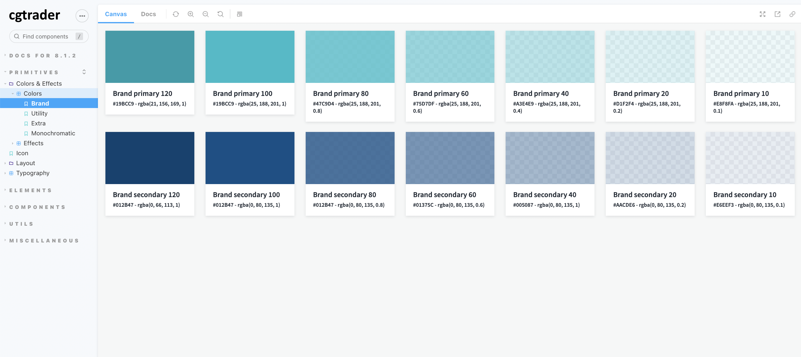
- Primitives - the smallest things, like Colors & Effects, Typography, Icons, etc.
- Elements (Atoms) - the smallest components, like Buttons, Inputs, Tags, etc.
- Components (Molecules) - more complex components made of several atoms, like Cards, Search, Dropzone, etc.
- Utils - utility functions, like pluralize, useBreakpoint, etc.
- Miscellaneous - all the components we already had in the UI library but not in the new Design System. Those components should be updated or removed at some point, if they are not used in the Design System.
MDX documentation
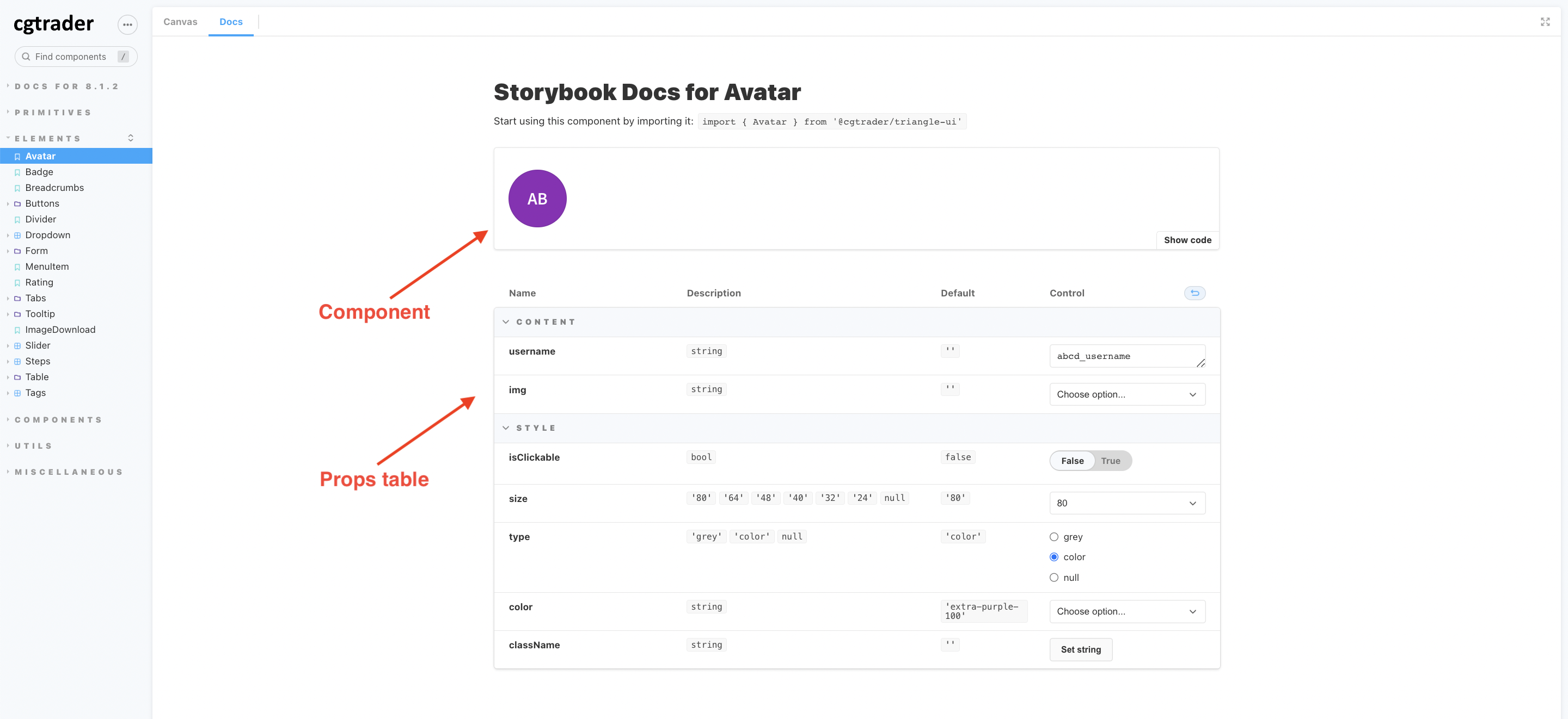
We used MDX to write documentation for our components. That allowed us to write our documentation in Markdown but also use React components in it.
A cool feature of these docs is that props are automatically listed from the component's propTypes.
This way, you don't have to write them down manually, and you can be sure that they are always up to date.
Also, they are interactive, so you can change them and see how the component changes. 🎉
You can even go a step further with your documentation and add comments before each prop, like this:
/**
  The avatar's size.
*/
size: PropTypes.oneOf(['small', 'medium', 'large']),
This will show up in the docs as a description for the prop. We didn't use this feature a lot, but it's an excellent option to have if you need to add more details to your docs.
What we did use was the argTypes option,
which allows you to customize the props table. For example, we used it to split the props into categories and add custom
controls for some of them. Here's a code snippet of how we did it for the Avatar component:
<Meta
  title="Elements/Avatar"
  component={Avatar}
  argTypes={{
    size: {
      table: {
        category: 'Style',
      },
    },
    color: {
      table: {
        category: 'Style',
      },
      control: {
        type: 'select',
        options: colorsListArray,
      },
    },
    username: {
      table: {
        category: 'Content',
      },
    },
    ...
  }}
👉 Figma
We used Figma to design our components. We had separate files for our components, where we could see all their variations, how they looked, and how they behaved.
Here is an example of a Toggle component in Figma, where you can see all the different variations of its size, width, and styles:
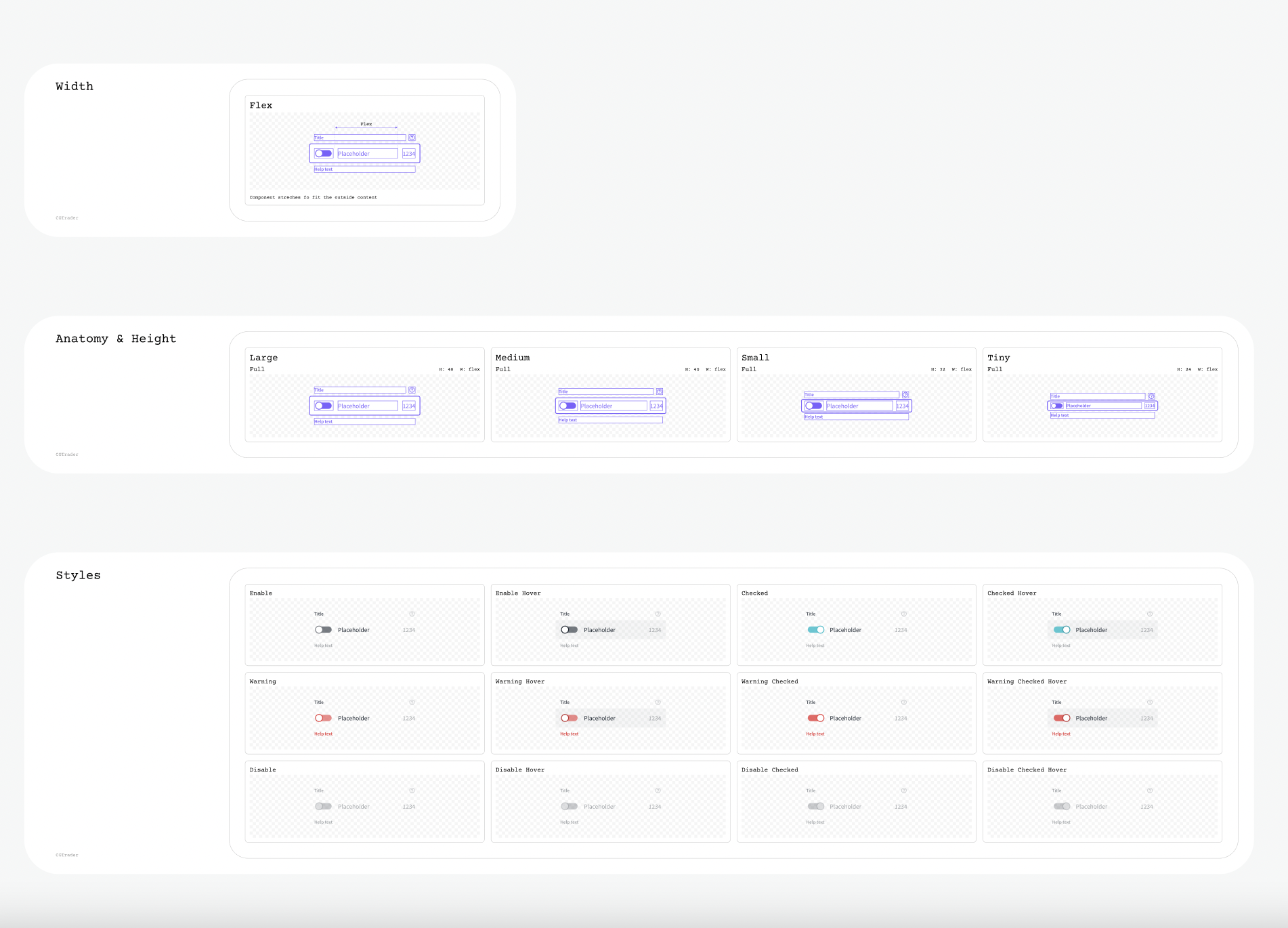
Everything listed like this made it easier for the developers to see all the variations they had to create.
👉 Prop naming
We used the same naming for our props in the code as in Figma. Because docs were created on Figma first, developers just had to copy the names from there and use them in the code.
For example, if we had a Tab component with a leadIcon property, we would name the prop the same in code and Figma.
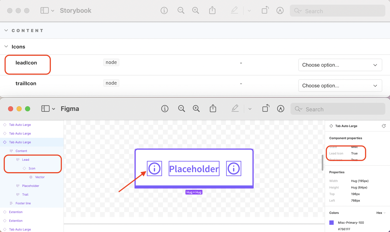
Having the same (or as close as possible) naming made it easier for developers and designers to communicate and understand each other.
👉 Utility classes
We have created some utility classes that we could use for easier styling. For example:
.cgt-text-caption- for text withcaptionstyle.cgt-text--align-center- for centering text.cgt-heading-#{$size}- for headings, where#{$size}is a size variable from our design system (e.g.,h1).cgt-color-#{$color}- for setting text color, where#{$color}is a color variable from our design system (e.g.,brand-primary-100).cgt-back-color-#{$color}- for setting the background color, where#{$color}is a color variable from our design system (e.g.,white-100)
👉 className prop for custom styling
In an ideal world, we would have all the styling in our design system, but sometimes we needed to add custom styling - it
was just unavoidable in how our product was built. For that reason, we added a className prop to all our components so
that developers could easily add custom styling. It was never made for major styling changes but only for
minor tweaks or better positioning.
Result 🎉
Even though I see some room for improvement, I'm happy with the result. What we achieved with limited time and resources is amazing and for the "first version" of our design system, I think it's pretty good.
We have a consistent and accessible product that benefits our designers and developers. Having a unified look and feel across the whole product is important, so I'm happy that we have built a design system that will help us achieve that.
Thank you for reading, and I hope you learned something new today! For more updates, you can follow me on Twitter.
Stay happy, healthy, and curious! 🍀
- desinni